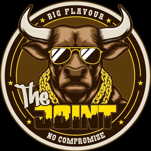
JOINT

Brand tokens, typography hierarchy, layout containers, food allergen badges, ShadCN UI component primitives, form controls, team roster cards, and brand motifs.

Semantic Role System

Semantic Color Palette & Dynamic Relative Shades

Role-based color tokens with dynamically calculated light/dark step shades (color-mix()) and visual transparency grids over checkerboard overlays. Zero component code changes required for future rebranding.

#F5C400Click to Copy HEX
-30%
-15%
Base
+15%
+30%

Primary (Highlight)

--primary

Role: Primary CTA & Brand Highlight

Used for primary CTAs, active states, price badges, sunglasses/jewelry logo highlights, and focus rings.

Visual Transparencies (Checkerboard Background Overlay)
10%--primary-10
20%--primary-20
50%--primary-50
80%--primary-80
#3D2314Click to Copy HEX
-30%
-15%
Base
+15%
+30%

Secondary (Gourmet Tone)

--secondary

Role: Secondary Actions & Panels

Used for secondary buttons, gourmet burger theme panels, lower city skyline buildings, and warm dark accents.

Visual Transparencies (Checkerboard Background Overlay)
10%--secondary-10
20%--secondary-20
50%--secondary-50
80%--secondary-80
#FAF5E9Click to Copy HEX
-30%
-15%
Base
+15%
+30%

Foreground (Text)

--foreground

Role: Primary Typography & Copy

Used for main body copy, horns, logo highlights, arch badge text ('BIG FLAVOUR'), and crisp high-contrast text.

Visual Transparencies (Checkerboard Background Overlay)
10%--foreground-10
20%--foreground-20
50%--foreground-50
80%--foreground-80
#0B0C10Click to Copy HEX

Background (Surface)

--background

Role: Page Backdrop & Baseline

Used for main page background, card containers (#16181E), drop shadows, and street dark mode baseline.

Visual Transparencies (Checkerboard Background Overlay)
10%--background-10
50%--background-50
80%--background-80
#E63946Click to Copy HEX
-30%
-15%
Base
+15%
+30%

Destructive (Alert / Spicy)

--destructive

Role: Spicy Badge & Action Alerts

Used for spicy allergen tokens, fiery burger accents, alert banners, and destructive actions.

Visual Transparencies (Checkerboard Background Overlay)
10%--destructive-10
20%--destructive-20
50%--destructive-50
80%--destructive-80
#2A9D8FClick to Copy HEX
-30%
-15%
Base
+15%
+30%

Success (Fresh / Vegan)

--success

Role: Vegan & Fresh Dietary Badges

Used for vegan and vegetarian badges, fresh vegetable accents, and positive status indicators.

Visual Transparencies (Checkerboard Background Overlay)
10%--success-10
20%--success-20
50%--success-50
80%--success-80
Brand Fonts

Typography System

Curated Google Font stack establishing brand hierarchy: Mr Dafoe marker script, Rubik (900 Black weight) block display, Rye woodcut Western slab, and Inter UI sans.

Marker Script--font-marker

Mr Dafoe

Dynamic marker script used for handwritten graffiti accents like "The", signature stamps, badge highlights, and casual tags.

The JointFlame-Grilled Perfection
Block Display (Black 900)--font-display

Rubik (900 Weight)

Ultra-bold Black weight display font used for heavy headlines ("JOINT"), section headers, chunky buttons, menu titles, and price tags.

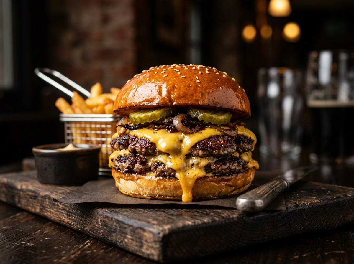
JOINT BURGERSDOUBLE CHEESE SMASH — £10.50
Western Slab-Serif--font-slab

Rye (Wood / Western)

Authentic woodcut Western display font used for arch badge caps ("BIG FLAVOUR", "NO COMPROMISE"), subheadings, and vintage badge text.

BIG FLAVOURNO COMPROMISE
Body & UI Sans--font-sans

Inter

Used for high-readability body copy, menu ingredient lists, dietary descriptions, buttons, and admin forms.

2x 4oz Aged Beef Patties, Smoked Bacon, American Cheese, Pickles & House Secret Joint Sauce.

Served on a toasted brioche bun.
Layout Architecture

Section & Content Container Rule

Every page section uses <section> wrapping a <div className="content"> bounding box centered exclusively via Flexbox (flex flex-col items-center) without raw margin rules.

<section className="w-full flex flex-col items-center justify-center">
<div className="content max-w-7xl w-full flex flex-col items-center justify-center">

Bounding Box Content Area (Centered via Flexbox: flex flex-col items-center justify-center)

Padding: 1.25rem (mobile) / 2rem (desktop) | Max Width: 87.5rem (1400px)
Allergen & Dietary System

Allergen & Dietary Badges

Complete set of all 14 official UK food allergens plus dietary preferences (Vegan, Vegetarian, Spicy). Badge layout automatically adapts: compact icon-only badges on mobile menu cards, full label badges on desktop views and item detail pages.

Active Mode: autoAll 17 Badges Displayed
🌶️Spicy🌱Vegan🥬Vegetarian🌾Gluten-Free🥛Milk / Dairy🌰Tree Nuts🥬Celery🦐Crustaceans🍳Eggs🐟Fish🌸Lupin🦪Molluscs🌭Mustard🥜Peanuts🥯Sesame🫘Soya🍷Sulphites
Mobile Menu Card ViewportCompact Layout

On mobile screens, menu item cards display icon-only allergen badges with tooltip title labels:

The Double Joint BurgerAged beef, cheese, bacon & secret sauce
🌶️🥛🌾
Desktop & Item Detail ViewportFull Expanded Layout

On desktop views and item detail modals, badges display full icon and text labels:

The Green Joint Burger£11.50
🌱Vegan🌾Gluten-Free
UI Components

Buttons & Menu Cards

Interactive element standards built on ShadCN UI primitives.

Button Component

Base ShadCN Button primitive supporting CVA size, color variants, and disabled states.

ShadCN Commandnpx shadcn@latest add button
Active Variant Scale (Default Size h-12)
Disabled Variant Scale (Disabled State)
Size Hierarchy

Card Component & Grid Integration

ShadCN Commandnpx shadcn@latest add card
Dialog Overlay System

Modal & Dialog Components

Standardized dialog overlays built on ShadCN UI primitives for booking forms, item customization, and user alerts.

Dialog Component Controls

ShadCN Commandnpx shadcn@latest add dialog
Form Controls

Forms & Input Components

Design system form standards, input controls, select dropdowns, feature switches, and compliance checkboxes built on ShadCN UI primitives.

Select Components

ShadCN UI Primitives
Custom SelectShadCN Select
ShadCN Commandnpx shadcn@latest add select
Design Specifications & When to Use:
  • Custom animated popover menu with backdrop blur styling.
  • Supports grouped item sections with custom group headers.
  • When to use: Use for rich option items, grouped sub-menus, search filtering, and uniform visual rendering across all desktop and mobile browsers.
Native SelectShadCN Native Select
ShadCN Commandnpx shadcn@latest add native-select
Design Specifications & When to Use:
  • Renders standard OS dropdown menus with custom arrow styling.
  • Triggers native mobile OS controls (iOS wheel picker / Android drawer).
  • When to use: Use for simple single-value choices, lightweight high-performance forms, and fast mobile OS touch accessibility.

Switch & Checkbox Controls

ShadCN UI Primitives
Toggle SwitchShadCN Switch
ShadCN Commandnpx shadcn@latest add switch
Design Specifications & When to Use:
  • Pill-shaped toggle switch thumb slider.
  • When to use (Service Options & Features): Use switches when selecting whether or not a user wants to enable or disable optional feature packages, service preferences, or dietary station options within an offering.
CheckboxShadCN Checkbox
ShadCN Commandnpx shadcn@latest add checkbox
Design Specifications & When to Use:
  • Square state indicator with check icon badge.
  • When to use (Form Actions & Compliance): Use checkboxes for form acknowledgments, user consent agreements (Terms & Conditions), newsletter opt-ins, and multi-selection confirmations submitted alongside a form action.

Form Example

Composite Layout
Private Event & Catering Hire
Book The Joint gourmet burger van for weddings, corporate celebrations, birthday parties, or private festivals across South Wales and beyond.
Event Package Options (Toggle Switches)
Form Compliance & Consent (Checkboxes)
Disclosure & Layout Controls

Accordion & Tabbed Layouts

Progressive disclosure patterns and tabbed view controls built on official ShadCN UI primitives.

Accordion CollapsibleShadCN Accordion
ShadCN Commandnpx shadcn@latest add accordion

Our package includes 28-day aged beef smash patties, brioche buns, house sauces, seasoned fries, and a dedicated 2-person chef team for your event.

Design Specifications & When to Use:
  • Vertical stacked disclosure panels with smooth expand/collapse transition.
  • When to use: Use for FAQ sections, detailed ingredient breakdowns, policy terms, and reducing vertical scroll length while keeping details accessible.
Tabbed LayoutShadCN Tabs
ShadCN Commandnpx shadcn@latest add tabs
Gourmet Smash Burger Menu

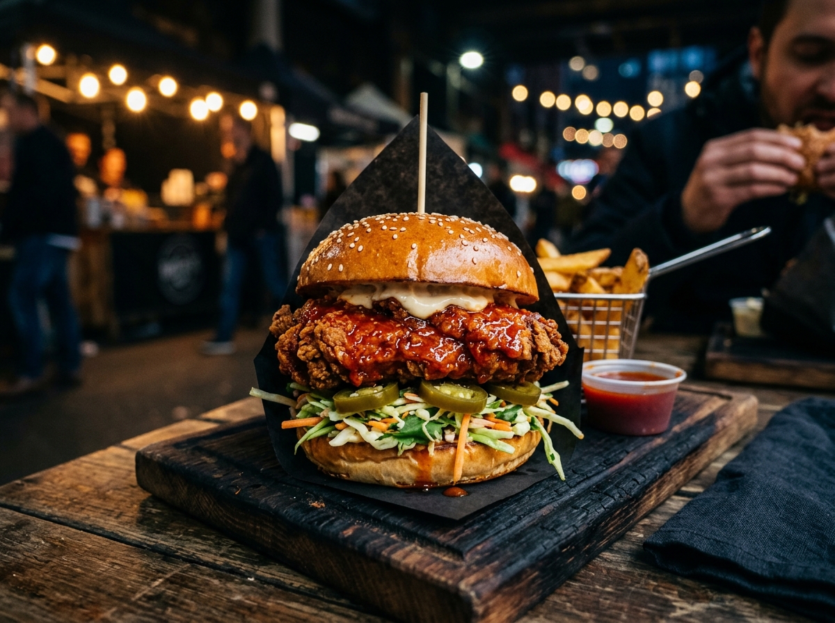
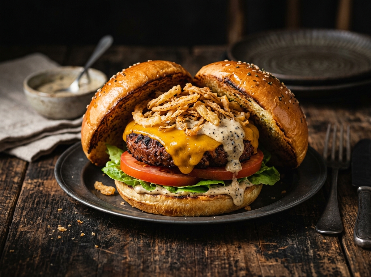
Featuring our signature 28-day aged beef Double Cheese Smash, Truffle Beef Stack, and Buttermilk Fried Chicken Hot Bird.

Design Specifications & When to Use:
  • Segmented horizontal navigation bar switching active content containers without page refresh.
  • When to use: Use for organizing related content into distinct views (e.g., category switching, pricing tiers, or multi-tabbed specifications) while preserving page context.
Team Roster

Founders & Dedicated Team

Team roster card component specifications featuring portrait rings, title badges, quote blocks, and item preferences.

Co-FounderCo-Founder
Eughine
Eughine
Co-Founder & Music/Atmosphere Lead

"The Joint didn't start with a business plan. It started with a burger."
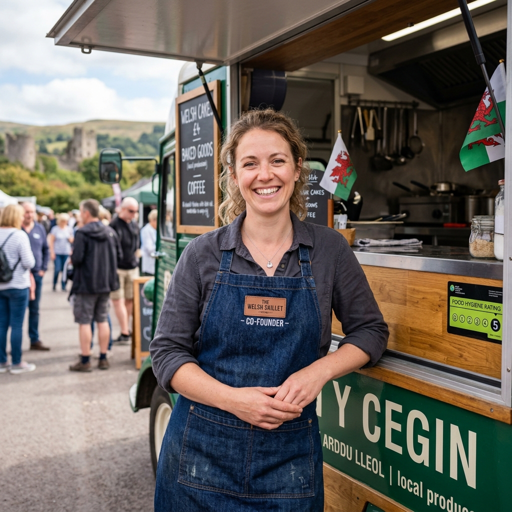
Background in music and live events. Focused on creating good atmosphere, bringing people together, and giving them a reason to come back.
Co-Founder & Recipe CreatorCo-Founder
Julie
Julie
Co-Founder & Culinary Director

"We're just making the kind of burgers we always wanted to eat."
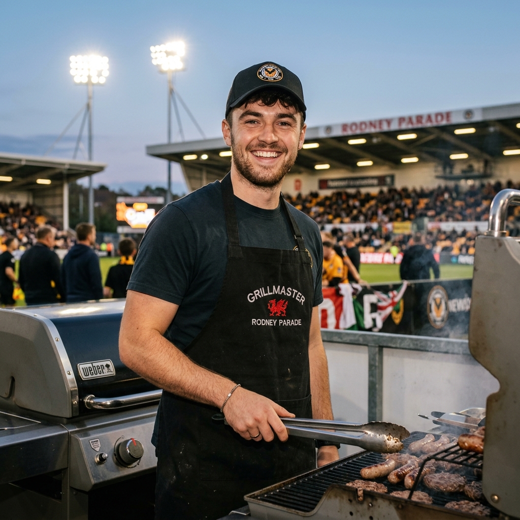
Co-founded The Joint with Eughine. Experimented at home with recipes, meat mixes, seasonings, cheese, and sauces until 'we should sell these' became reality.
Main Man on the Grill
Steve
Steve
Head Grillmaster

"Smashed fresh to order on every single shift."

The man on the grill at plenty of Eughine's events over the years. Now our main man behind the grill cooking the food that started all of this.